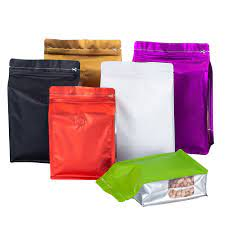
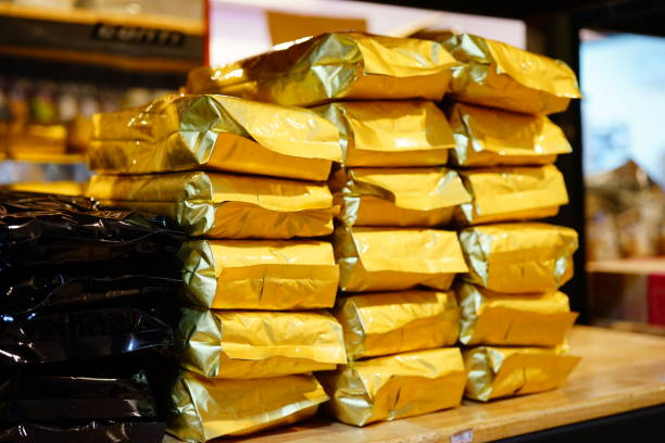
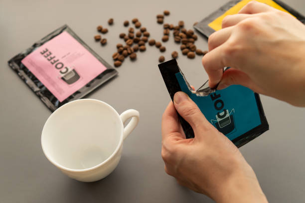
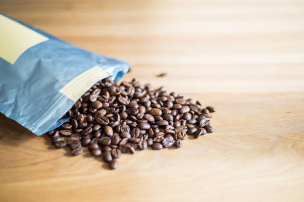
The colour of a coffee roaster’s bag may influence how people view the business and its ideals, increase brand awareness, and bolster customer confidence.
According to a KISSMetrics survey, 85% of buyers think colour is the main factor influencing their choice to purchase a product. Even strong emotional responses to some colours, such as enthusiasm or sorrow, have been known to occur.
For instance, in coffee packaging, a blue bag could provide the idea that the coffee is newly roasted to the client. As an alternative, it may let them know they are buying decaf.
It’s critical for speciality coffee roasters to comprehend how to use colour psychology to their advantage.
Roasters must consider how customers will react to the colours they put on coffee bags, whether it’s to advertise a limited edition line, call attention to their brand, or accentuate certain flavour notes.
I met with Jake Harris, managing director at Mokoko Coffee & Bakery in Bristol, to learn more about what the colour of your coffee bag says about your roastery.
What difference does coloured coffee container make?
Recent studies have shown that shoppers will form an opinion of a business within 90 seconds of visiting a store, with 62% to 90% of the impressions being based only on colour.
Customers often see colours similarly regardless of the brand; this is because colours are more firmly embedded in human psychology than symbols and logos.
This implies that firms may appeal to a large audience without redesigning their products for various regions.
Deciding on a single colour for coffee bags can be challenging for specialised roasters. It not only significantly affects brand identification, but once people grow accustomed to it, it can be hard to change.
Nonetheless, using strong, vivid colours has been proven to increase brand recognition both offline and online. This thus encourages more recurring purchases.
Customers are more likely to trust a roaster’s brand over others they haven’t experienced before when they can recognise it.
A roaster’s colour selection must be wise given that an astounding 93% of people apparently pay attention to looks when purchasing a product.
Using colour psychology in coffee packaging
According to studies, words and forms are processed after colour in the brain.
For instance, many people immediately conjure up the American fast-food juggernaut McDonalds and its recognisable yellow arches when they think of the colours red and yellow.
Also, individuals frequently instinctively associate particular colours with specific emotions and psychological states. For example, whereas green is typically associated with thoughts of wellbeing, freshness, and nature, red may evoke sentiments of wellness, vitality, or enthusiasm.
Nonetheless, it is crucial for roasters to take into account the psychology underlying the colours they select for their coffee bags. Importantly, 66% of buyers believe they are less inclined to purchase a product if the colour they prefer is not present.
It can thus be difficult to limit one’s palette to a single colour.
Colored coffee packaging can subtly influence customers’ choices without their awareness.
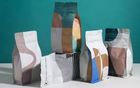
Earthy hues are excellent for projecting elegance and a sense of connection to nature; they make sustainable coffee bags look beautiful.
Nevertheless, vivid and brilliant colours may give a brand a youthful and energising impression. Also, the colour scheme—like that employed by Mokoko Coffee—might indicate the coffee’s origins.
According to Jake, who has more than 20 years of expertise in the coffee and hotel industries, “the colours utilised on our coffee bags were influenced by the native nation.” “Furthermore, the imaginative artwork that is depicted throughout that nation’s history.”
He notes that Mokoko wants to have fun while honouring her nation of birth. Hence, he continues, “we created a label design specifically for each county we purchase from.
More than a dozen nations are sourced by Mokoko Coffee, including Brazil, Peru, Uganda, Ethiopia, India, and Ethiopia. It changes up its selection, giving seasonal coffees that highlight the best of the area.
Jake continues, “We looked into the history and street art of each nation to obtain the inspiration for our labels.
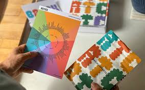
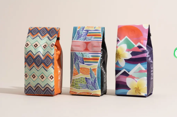
On a clean white background, the custom-printed coffee bags from Mokoko offer vivid colour splashes and regionally relevant artwork.
Its Ethiopian La Plata coffee, for instance, features a vibrant geometric display, while its Brazil Finca Espana coffee bag features illustrations of geckos, cactus, and toucans.
Customers may better understand what to anticipate when preparing a cup of coffee thanks to the colour scheme and picture choices, which express the vibrancy of the coffee within.
Colored coffee packaging can also be used to communicate flavour notes, coffee strength, and the type of bean inside the bag. For instance, amber and white colours are frequently used to represent flavours like caramel or vanilla.
Things to take into account while creating coffee bags
Although while the colour of coffee packaging is significant, when designing bags, there are still other things to take into account.
Voicing and promoting brand values
In order to communicate a company’s beliefs and stories to customers, branding is equally crucial. Roasters may employ colours like black, purple, or nay to represent a brand’s emphasis on extravagance and luxury.
An alternative would be for a corporation choosing inexpensive quality to demand a friendlier colour, like orange, yellow, or pink.
Branding must be consistent throughout the whole business, not only on coffee packaging. It must also be carried out with a marketing plan in mind.
Coffee bags need to stand out on more than just grocery shelves; they also need to be eye-catching online.
Marketing is crucial for contemporary enterprises, from developing eye-catching pictures to enhance a roaster’s brand presence and “stop the scroll” on social media to enhancing a company’s ethos and voice.
Roasters must build their brand voice and integrate it throughout all aspect of their business, including packaging, labelling, websites, and physical locations.
Delivering on promises with coffee packaging
The packaging must resemble a bag of coffee given that coffee is more than simply a flavour in order to further boost brand identification.
A coffee bag that resembles a burger box, for example, could stand out from the other coffee on the shelf, but it will also confuse customers.
The logo of a roaster must be uniform on all coffee containers. Roasters want their coffee beans to not be linked with carelessness and messiness, which inconsistent packaging might suggest.
You should be aware that not all roasters will be able to alter the colour of every coffee bag. Instead, they can use color-coded or custom-printed labels to differentiate distinct flavours and mixes while keeping the packaging’s colours constant.
This enables crucial brand awareness and lets customers know what to anticipate.
Branding is a crucial consideration since it tells customers about a company’s history and core beliefs.
The colour scheme of the coffee bags should complement the roaster’s logo and branding. A lavish and opulent coffee brand may, for instance, utilise bold hues like black, gold, purple, or blue.
Instead, a company that wants to look more approachable can choose warm, inviting colours like orange, yellow, or pink.
Cyan Pak use cutting-edge digital printing technology to ensure that your colourful coffee bags are consistent across all marketing platforms.
We can assist you in selecting from a variety of sustainable materials and extra components to create the ideal packaging for your requirements.
Packaging solutions like kraft paper or rice paper, both of which are 100% biodegradable or recyclable, are available. Both choices are natural, biodegradable, and compostable. PLA and LDPE coffee bags are more options.
Contact our team for more information about sustainable, custom-printed coffee bags.
Post time: Apr-18-2023
