Coffee has enormous appeal on a global scale, and although the specialty coffee industry is very much a community, it can also be extremely competitive.
This is why a roastery's success depends on having the correct branding on its coffee bags. It encourages people to pick your coffee over a rival and aids in attracting the attention of your chosen target group.
Nevertheless, there are a variety of coffee bag branding options available, making it difficult to choose the best style for your company.
It might be worthwhile to consider the competition when it comes to replicating the coffee bag branding style throughout the roastery.
Learn about some of the most popular looks to use as a model for your coffee brand design so it will complement your roastery's aesthetic.
Coffee package with effective branding
Customers frequently relate to and sense a connection to a successful brand's personality and offerings.
It does, however, depend on uniformity across digital platforms, coffee packaging, and roasteries.
Language, imagery, typeface, and color schemes are just a few ways to influence a brand's style.
Minimalist coffee bags
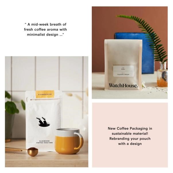
Simple line logos and neutral color schemes are prominent features of minimalist design, which has gained favor in recent years.
Because it frequently enables the product within to completely shine, this type of coffee packaging is perfect for roasteries who want the product to speak for itself.
Clean, straightforward designs are typical of minimalist packaging, which is frequently regarded as modern and stylish. It can be a very effective way to sharpen your branding and make the company name or logo stand out because it won't be competing for customers' attention with loud colors or images.
Elegant and contemporary, minimalist coffee packaging is a great way to present your coffee.
coffee package with a green theme
Using earthy and neutral colors in the design of your coffee bag can communicate your company's commitment to sustainability and eco-credentials.
Coffee packaging with an eco-friendly design can reflect the values and standards of your business.
Green, brown, blue, and white are hues that are linked to nature and can evoke feelings of peace and tranquility.
Additionally, these hues are frequently thought of as more sensible and comforting. An earthy color scheme can reinforce the value of your brand's ethical principles, whether they involve obtaining Fairtrade coffee, farms that are friendly to birds, or farms run by women.
More specifically, there has been a rise in demand for packaging consisting of recyclable and renewable materials as well as eco-friendly printing possibilities.
As a result, unbleached kraft paper or rice paper coffee bags have gained popularity.
When treated, both offer strong defenses against the usual foes of coffee—oxygen, light, moisture, and heat—while offering a portable, eco-friendly, and affordable packing option.
Playful illustrations on coffee bags
Hand-drawn illustrations are starting to seem more and more unusual as digitalization becomes more and more common.
Their inclusion in your coffee packaging could contribute to giving your roastery character, humor, or, depending on the illustration, a touch of whimsy.
In recent years, there has been an increase in demand for handcrafted items and goods with a rustic and distinctive appearance.
Customers appear to be turning away from slick graphics and toward authenticity and regional handicraft in greater numbers.
A humorous, playful, and most all, memorable brand style can be developed with the help of illustrations. A smart graphic almost always catches the eye of customers and makes them grin.
The Gentlemen Baristas, a roastery that names each of its coffees after a different style of hat, provides a good illustration on coffee bag usage.
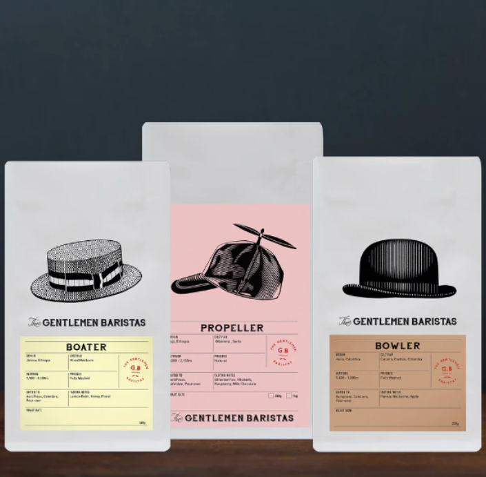
Each coffee bag has a detailed line drawing of the relevant hat, giving the brand's claim that it "provides well-mannered coffee" a quirky yet classic touch.
old-style coffee package
A return to traditional fashion is being seen because of its nostalgic appeal.
For many roasters, this is a chance to give your brand a "time-honored" feel.
Retro bubble typefaces and color schemes from the 50s, 60s, and 70s have been popular as brands look for ways to leave a lasting impression with timeless designs.
Retro-inspired coffee bags may help to portray authenticity because many consumers could link older, more reputable businesses with higher quality.
Additionally, it might encourage them to buy your product because it might arouse sentimental feelings in them.
Roan Records, a merchant in London, is another example. It offers coffee to consumers who come into its stores. The company has incorporated the brand's emphasis on highlighting the enduring appeal of antique recordings into the look of their takeaway coffee cups.
Customers are given a worn-out, old sensation by the brand's aesthetic, which includes a faded burnout logo.
attention on typography in coffee bags
For many package designs, especially those for coffee brands, coffee shops, and roasteries, typography appears to have grabbed the helm.
Typography has a special way of establishing the proper tone for your company, from elaborate calligraphy-inspired styles to strong writing and hand-written fonts.
Additionally, it can be a desirable option for businesses that want to give their packaging personality while still making sure that it is instructive and appealing.
Whether you want to conjure a classic and traditional feel or a contemporary and entertaining brand, accentuating text with a jazzy font or colorful text can be successful.
Why coffee roasters should think about coffee bag branding
Coffee packaging must communicate a lot of information quickly.
Therefore, it's crucial that you pick a look that not only appeals to your target market but also rapidly grabs customers' attention.
There are many ways to highlight your brand's distinctive personality through your coffee packaging, ranging from modern branding for establishments that want to reflect today's culture to vintage fonts for companies that want to honor the past.
Strategy, planning, research, and creativity are all necessary for developing a powerful and consistent brand style. Additionally, it requires perseverance, clarity, intention, consistency, and consistency.
No matter which trend you're thinking of incorporating, CYANPAK can help. We'll work with you to strike a balance between your practical needs and your sustainability goals.
In order to reduce waste and promote a circular economy, we provide a variety of 100% recyclable coffee packaging options made from renewable materials like kraft paper, rice paper, or multilayer LDPE packaging with an eco-friendly PLA lining.
Furthermore, we provide our roasters total creative freedom by letting them create their own coffee bags. You can get assistance from our design staff in coming up with the appropriate coffee packaging.
Additionally, we provide custom-printed coffee bags with a short turnaround time of 40 hours and 24-hour shipping time using cutting-edge digital printing technology.
In addition, CYANPAK provides low minimum order quantities (MOQs) to micro-roasters that want to maintain flexibility while demonstrating their brand identity and environmental commitment.
Post time: Nov-27-2022
